Scaruffi.com

Reimagining Scaruffi.com

An accessibility-focused design proposal for one of the web’s oldest active blogs

UX Design
Accessibility
Usability
UI
Cognitive disability

WCAG 2.2

Where

Bay Area, CA

What

Website

Why

Increased usability

Role

Designer

Category

Music, Arts, Science

When

Jan 2021-Mar 2021

Why I worked on this

While browsing this site I found a request for a volunteer to “restyle” some of its most important pages. It was a unique challenge and a chance to make a widely used website more accessible.

Photo of me with my hand to my chin, pondering while looking towards the "Why I worked on this" copy

Background

Scaruffi.com is one of the web’s longest-running active blogs, home to Piero Scaruffi, an independent arts critic and lecturer on artificial intelligence at institutions like Stanford and Harvard. He is famous for uncompromising music criticism and a notoriously stringent rating system; he rates The Beatles’ best work at just 7.5/10. The site’s design hasn’t changed since the 90s, leaving plenty of room for better usability and accessibility.

User needs

The central problem

Serious music listeners are drowning in music. More music was released on any given day in 2024 than in the whole of 1989, according to an NME study. Wasting time on bad music is their primary pain point.

The claim

Listeners rely on critics to skip the bad music and get straight to the best releases. The critic spends their time so others don’t have to. But Scaruffi.com’s poor readability costs readers that saved time, undercutting the site’s whole value proposition.
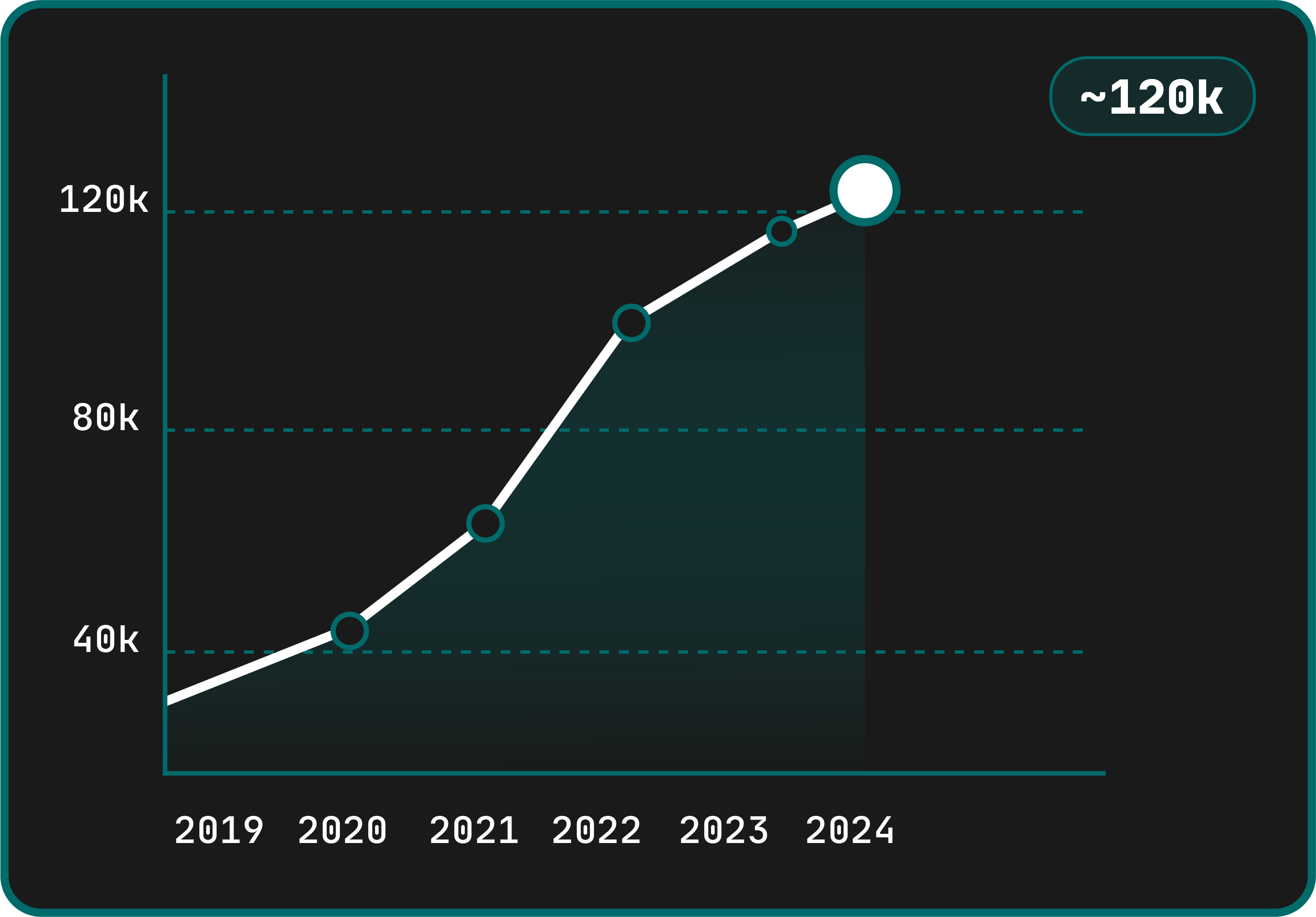
Graph showing the number of song uploads to Spotify daily from 2019-2024. trending from roughly 20,000 song uploads per day in 2019 to 120k song uploads per day in 2024

Tracks uploaded to Spotify per day

Source: Luminate's Year-End Music Reports

The website
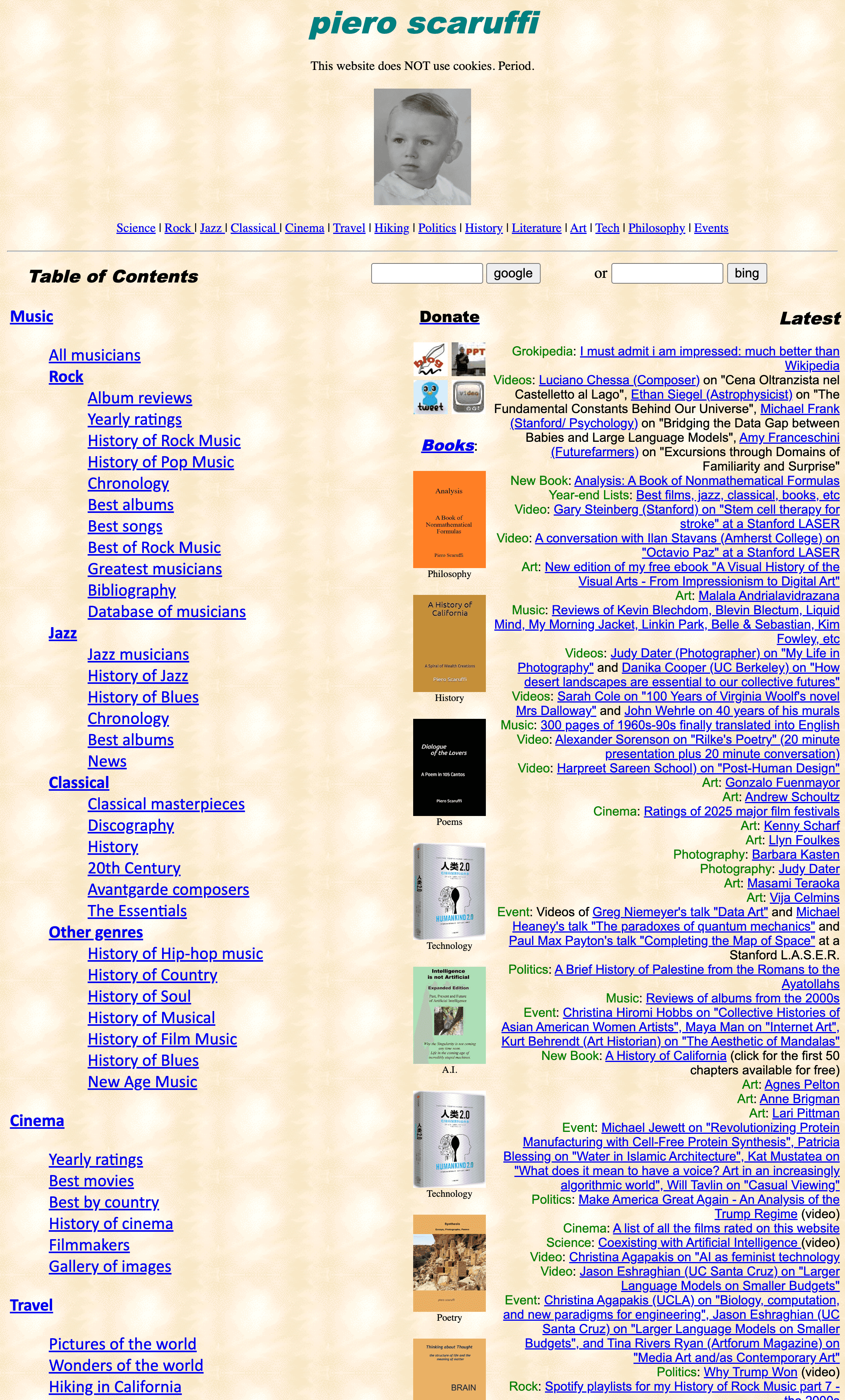
screenshot of the homepage of Scaruffi.com. the odd mixture of whimsy and chaos commonly found in 90s websites is well represented. This particular page is largely a collection of blue underlined links over a patterned beige-ish background

Immediate observations

Above is the upper fold of the Scaruffi.com homepage. Beyond the expected issues, missing alt-text (WCAG SC 1.1.1), non-descriptive link text (WCAG SC 2.4.4), and no heading elements at all, what struck me most was how hostile the site is to neurodivergent and cognitively disabled users, such as those with ADHD, Autism Spectrum Disorder, or Dyslexia. Better still, user research showed abled users were dissatisfied with the design too, so fixing the accessibility issues would improve usability for everyone.

Scaruffi's call to action

One day while browsing I stumbled across a dated “Volunteer” page, where Scaruffi was looking for someone to do the following…

  • “Restyling of the music pages. I have zero time to take care of style. The main page and the music page have not changed in perhaps ten years.”

  • “Redesign biographical pages as frames”

My Plan

With little UX work and no portfolio to my name, emailing him to ask for the job seemed pointless. So I just did the redesign. In place of client questions, I leaned on years of familiarity with Scaruffi and his preferences, and planned to send him the result.

The goal

Create a highly usable website that is more friendly to disabled users, which at the same time respects the design heritage of Scaruffi.com and incorporates elements of Piero's original vision in 1998.

Primary concerns

  • Readability

  • Cohesion

  • Responsiveness

These were the three areas of concern that kept surfacing. Improve all three on the pages he wanted redesigned, and the whole site gets significantly more usable.

Readability

This website is essentially a collection of links to blog posts, so job one was making it readable. First, what was broken…
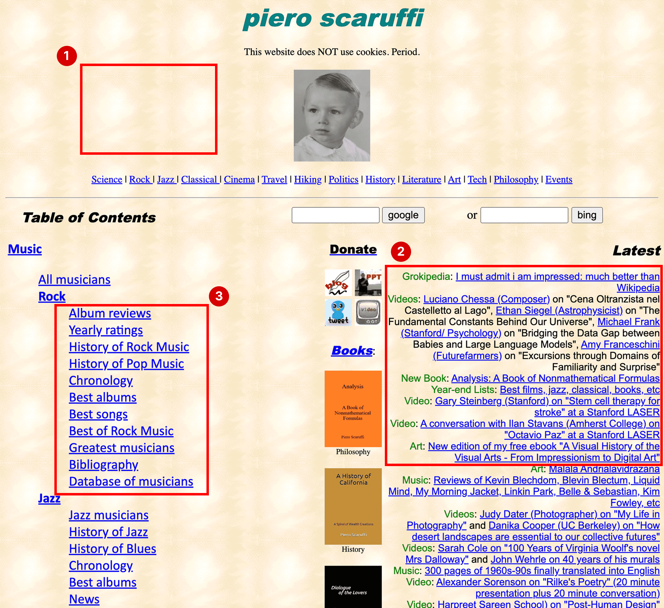
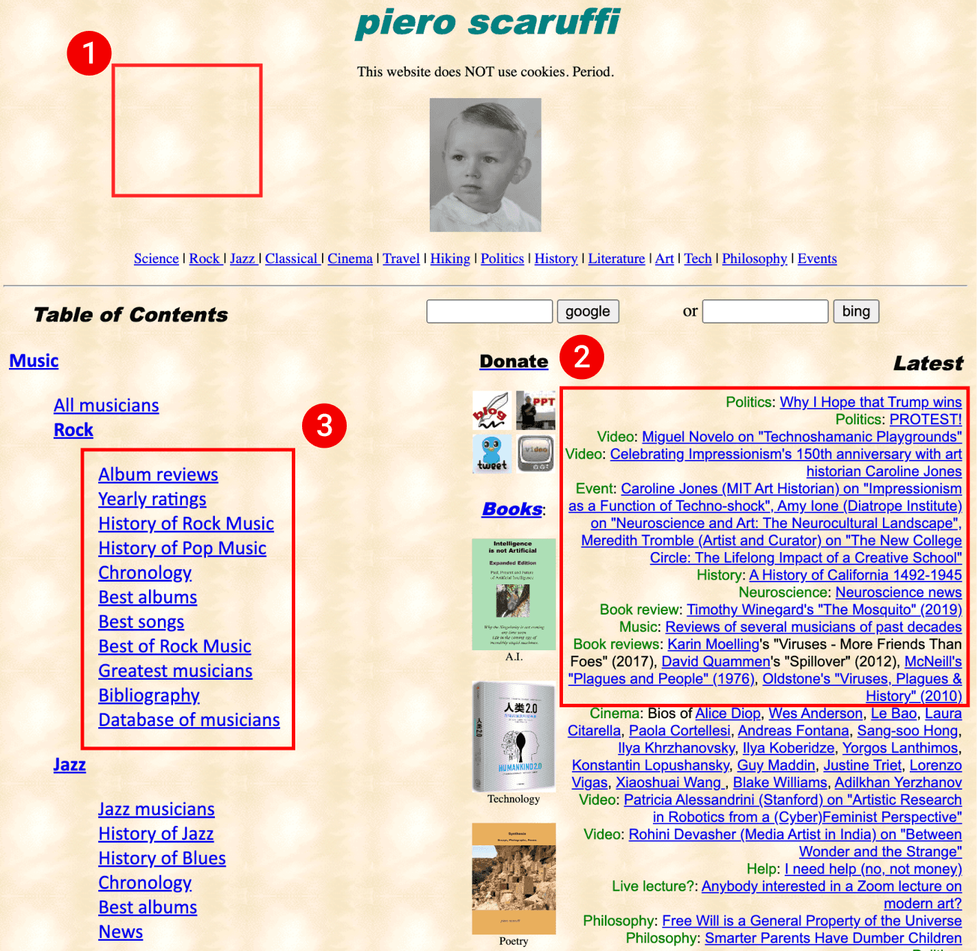
Annotated screenshot pointing out where the specific issues are. Labeled #1 is a red rectangle simply highlighting the patterned background of the website. Labeled #2 is a rectangle highlighting a bunch of text that is aligned to the right. Labeled #3 is a rectangle highlighting a bunch of linked text

1. Patterned background

A classic artifact of the old internet. Patterned backgrounds were everywhere in the late 90s, but we now know they hurt readability: they reduce text contrast (WCAG SC 1.4.3, Contrast Minimum), add visual noise, and increase cognitive load by forcing users to filter out the background.

2. Text aligned right

Right-aligned text fights the natural left-to-right reading pattern of western languages, making content slower to scan and more frustrating to read. WCAG SC 1.4.8 (Visual Presentation) specifically flags text presentation that breaks natural reading flow.

3. Excessive underlining, use of blue for links

Underlining links is good practice in moderation. But this site has entire pages that are just link collections, producing walls of underlined text. Studies, including one from the University of Hamburg, show underlining interrupts reading flow and hurts comprehension, while adding visual clutter.

Blue link text is another old-internet artifact. We have better ways of indicating links now, and here the sheer volume of blue text creates a glaring visual experience.

In short: this website needs a new way of indicating linked text.

Cohesion

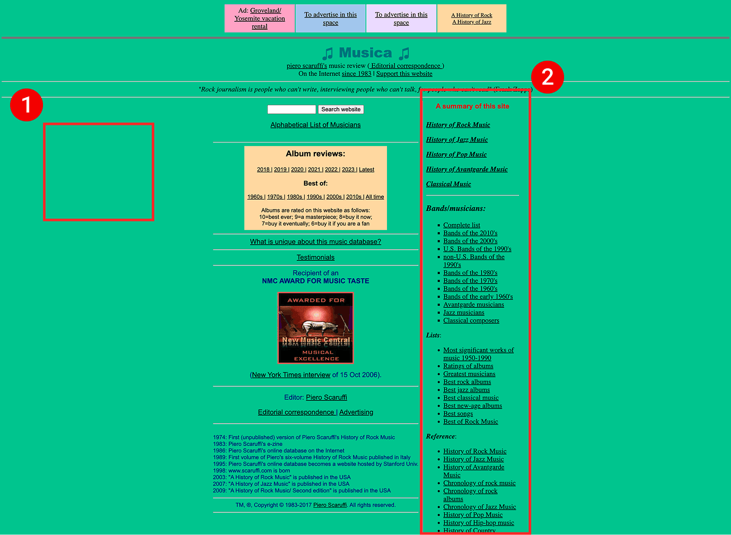
Scaruffi asked for the home, music, and bio pages to be redesigned. Below is the “music page”.
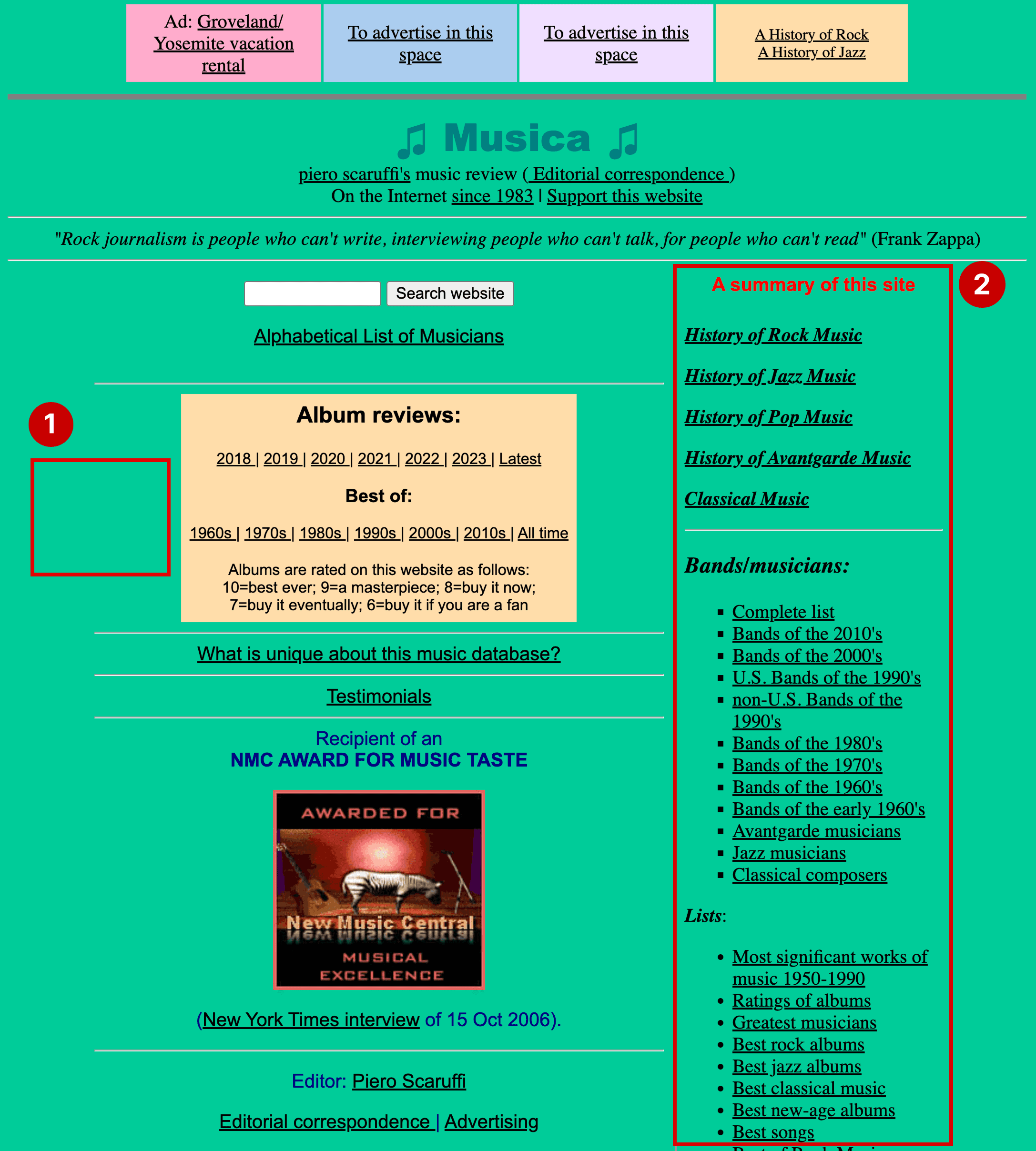
Annotated screenshot. Labeled #1 is a red rectangle highlighting the patterned background of the website. Labeled #2 is a rectangle highlighting a bunch of text that is aligned to the right. Labeled #3 is a rectangle highlighting a bunch of linked text

The music page, one of the most important pages on the site, barely looks like it belongs to the same website. Here’s why…

1. Inconsistent use of color

The music page’s background color appears nowhere else prominent on the site, not even the home page. Inconsistency like this increases cognitive load and makes the site harder to navigate.

2. Inconsistent layout

The links in this site-summary box also appear on the home page, where they sit on the left. They should sit on the left here too, for consistent navigation and better information architecture: a summary of the site’s most important sections should come before dates and testimonials. The yellow album-review links matter, but they can be highlighted without owning the left side of the page.

Responsiveness
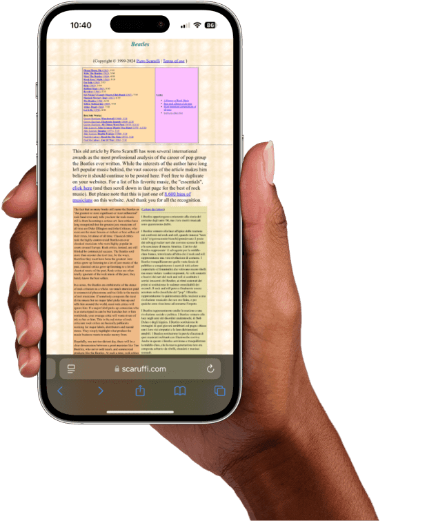
Mockup of a woman’s hand holding an iphone, using scaruffi.com. text is incredibly small because the site is not responsive

Here is the “Beatles” bio page. Scaruffi.com is not responsive, and using it on a phone is genuinely difficult. Type runs well below the recommended 16px body size, forcing constant zooming, and many link targets fall below the 24×24px minimum required by WCAG 2.2 SC 2.5.8 (Target Size Minimum, AA).

My Redesign

Screenshot of my redesign of the desktop version of the scaruffi.com homepage. it shows white text against a teal-green background. Contrast is highly improved and meets AA standards across the board

To replace all that blue underlined text, I used weight, typeface. and hover states to indicate links: anything in semi-bold or bold Open Sans is clickable, like everything under “Latest Posts” on the home page. All linked content appears gold on hover. I left-aligned the recent posts, moved “My Books” out of its awkward middle column, and consolidated the navigation down to Scaruffi’s most discussed topics plus a “more” dropdown. Consistent navigation placement across all three pages also addresses WCAG SC 3.2.3 (Consistent Navigation, AA).
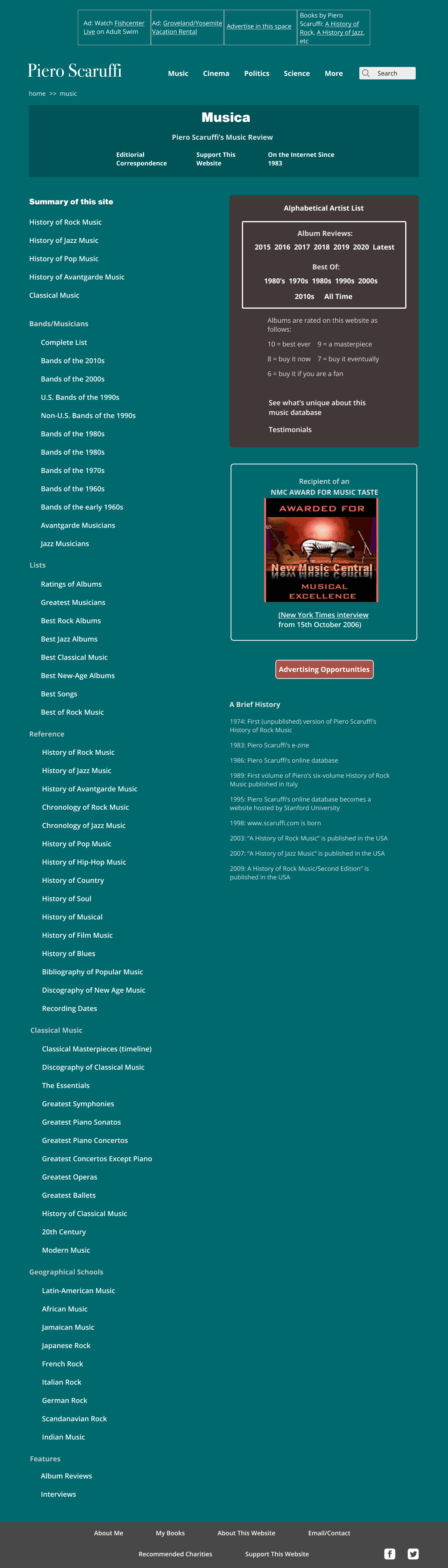
screenshot of my redesign of the music page of scaruffi.com

The music page needed to be scannable. I moved “Summary of this site” to the left, gave the artist-list and reviews-by-year links a dark background for emphasis, and pushed non-clickable text to light grey or out of bold Open Sans. I also added breadcrumbs at the top (WCAG SC 2.4.8, Location, AAA) because, remarkably, most pages on the original site had no easy way back to the home page at all.
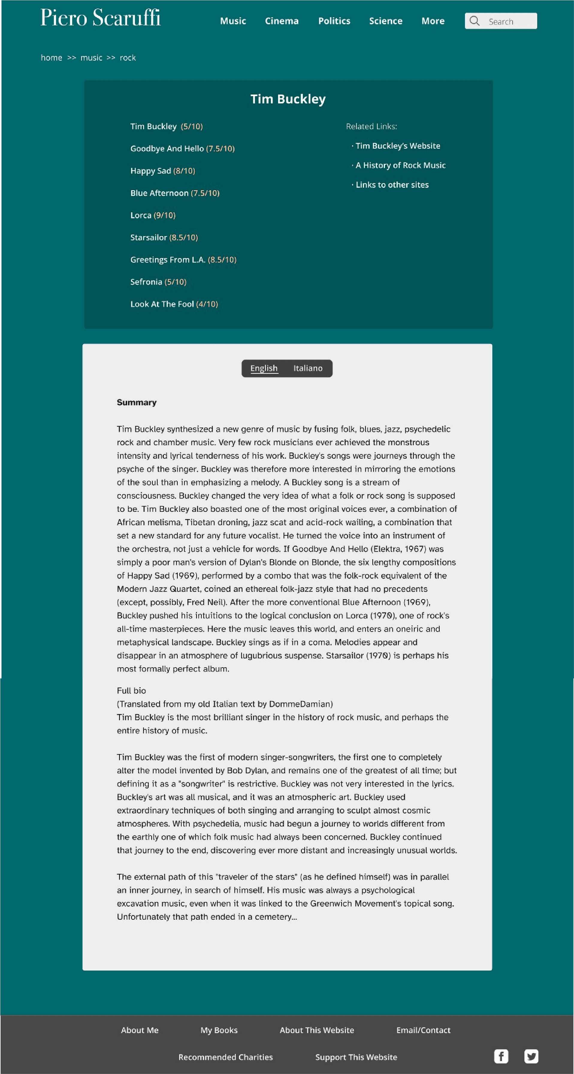
screenshot of my redesign of the bio page of scaruffi.com

The third page type: the bio pages. I kept the central layout while raising text contrast across the board and adding color to album ratings so they pop while scanning. Instead of two always-visible body columns, users now toggle between Italian and English. All body copy is set in Atkinson Hyperlegible, black on white, for legibility and a more classic look.
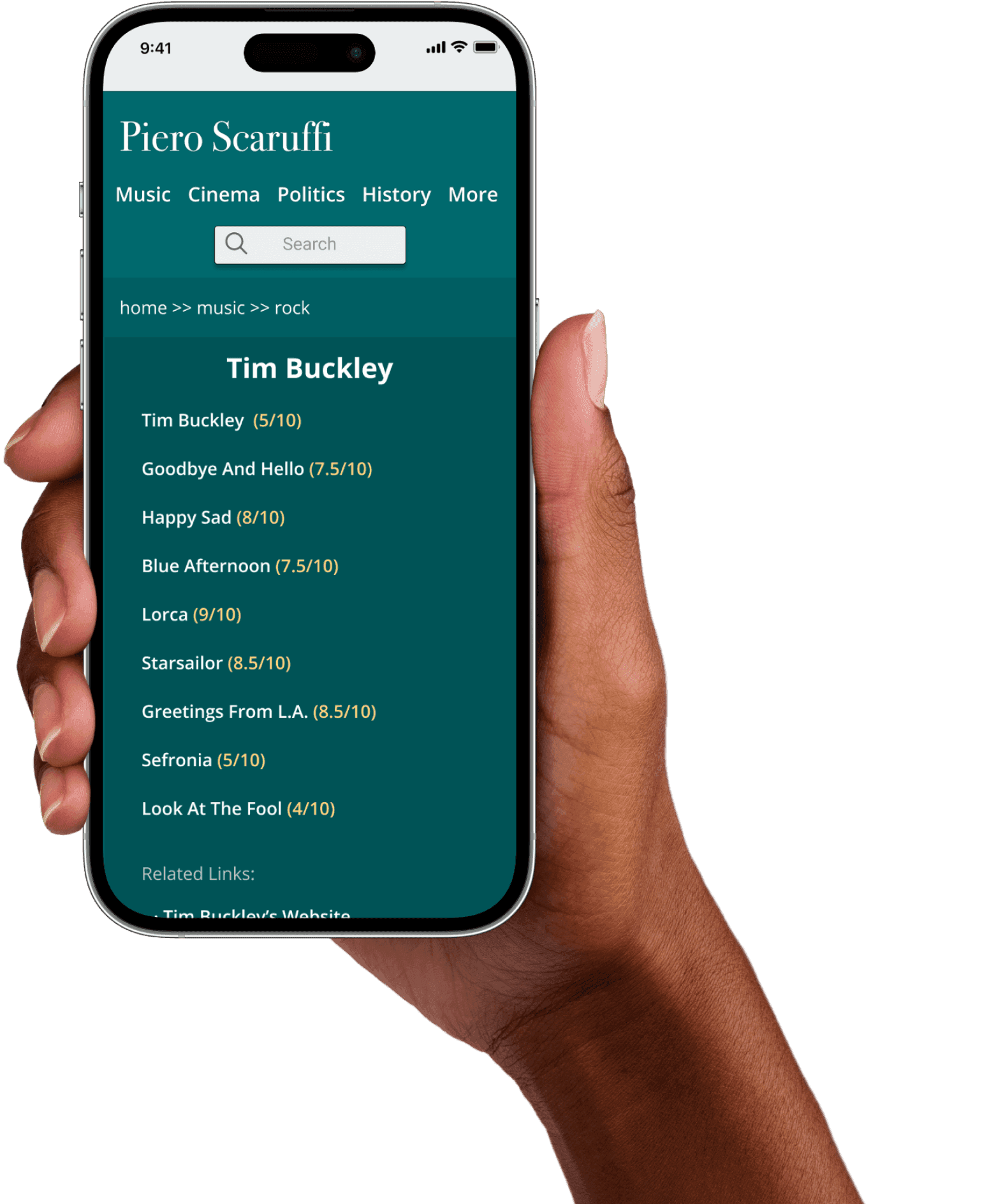
Mockup of a woman’s hand holding an iphone, using my redesign of scaruffi.com. text is nice and large and readable

Finally, the site needed to work on phones, so I designed mobile versions of all three pages. Above is the bio page. My two priorities: bigger type for readability, and room for properly sized touch targets. Below are the other mobile screens…

screenshot of the mobile version of my redesign of Scaruffi.com’s homepage
screenshot of the mobile version of my redesign of the “latest posts” page
screenshot of the mobile version of my redesign of the music page

Adapting the desktop design for mobile proved easy. Scaruffi already signals which information matters most, so I simply took his cues to order the mobile layout.

The pitch

With the screens ready, I sent Piero Scaruffi PDFs of the mockups along with this message…

“My name is Sam Donnelly and I’m a U.S.-based UX/UI Designer focused on accessibility as well as a daily user of your website. It came to my attention recently that you are looking for someone to help restyle and redesign parts of Scaruffi.com, and I would be tremendously excited to be involved. Given that I’m fairly inexperienced I thought the best way to demonstrate my ability would be to just go ahead and do a hypothetical redesign to give you an idea of what I currently have in mind. Of course, any and everything can be changed and this prototype is simply meant to show my ability and interest. That being said I do firmly believe your users would welcome these changes if you were to decide to implement a design similar to this which emphasizes accessibility.

I’ve attached two PDFs with screenshots of both a web and a mobile design, in case you are open to building a mobile/responsive version of scaruffi.com. Based on the description in the volunteer page on your website I got the sense that you are looking for more of a fresh coat of paint than a major overhaul, so I tried to keep that in mind while working on this. I would be happy to walk you through any design decisions and answer any questions you might have. I can also send over a clickable prototype if you would like.

Thanks for your time,


Sam”

Scaruffi’s response

Scaruffi liked the designs. His email opened with “It all looks extremely good”. Then: “but let me tell you why nobody ever succeeded in restyling my website…”

His current workflow suits him, it’s fast, and he refuses to depend on any software to maintain his site, which is perfectly understandable. His idea of a “designer” dated from an era when web designers were also front end developers; he wanted someone to redesign the pages and hand-code them too. That wasn’t me. Still, the project was a joy to work on and gave me a new perspective on preserving the legacy web while designing for accessibility.

Not every accessibility project ends in implementation - and that’s a reality of the work. The goal was always to demonstrate what was possible, and Scaruffi’s response confirmed the designs landed.

Reimagining Scaruffi.com

An accessibility-focused design proposal for one of the web’s oldest active blogs

UX Design
Accessibility
Usability
UI
Cognitive disability

WCAG 2.2

Where

Bay Area, CA

What

Website

Why

Increased usability

Role

Designer

Category

Music, Arts, Science

When

Jan 2021-Mar 2021

Why I worked on this

While browsing this site I found a request for a volunteer to “restyle” some of its most important pages. It was a unique challenge and a chance to make a widely used website more accessible.

Photo of me with my hand to my chin, pondering while looking towards the "Why I worked on this" copy

Background

Scaruffi.com is one of the web’s longest-running active blogs, home to Piero Scaruffi, an independent arts critic and lecturer on artificial intelligence at institutions like Stanford and Harvard. He is famous for uncompromising music criticism and a notoriously stringent rating system; he rates The Beatles’ best work at just 7.5/10. The site’s design hasn’t changed since the 90s, leaving plenty of room for better usability and accessibility.

User needs

The central problem

Serious music listeners are drowning in music. More music was released on any given day in 2024 than in the whole of 1989, according to an NME study. Wasting time on bad music is their primary pain point.

The claim

Listeners rely on critics to skip the bad music and get straight to the best releases. The critic spends their time so others don’t have to. But Scaruffi.com’s poor readability costs readers that saved time, undercutting the site’s whole value proposition.

Graph showing the number of song uploads to Spotify daily from 2019-2024. trending from roughly 20,000 song uploads per day in 2019 to 120k song uploads per day in 2024

Tracks uploaded to Spotify per day

Source: Luminate's Year-End Music Reports

The website

screenshot of the homepage of Scaruffi.com. the odd mixture of whimsy and chaos commonly found in 90s websites is well represented. This particular page is largely a collection of blue underlined links over a patterned beige-ish background

Immediate observations

Above is the upper fold of the Scaruffi.com homepage. Beyond the expected issues, missing alt-text (WCAG SC 1.1.1), non-descriptive link text (WCAG SC 2.4.4), and no heading elements at all, what struck me most was how hostile the site is to neurodivergent and cognitively disabled users, such as those with ADHD, Autism Spectrum Disorder, or Dyslexia. Better still, user research showed abled users were dissatisfied with the design too, so fixing the accessibility issues would improve usability for everyone.

Scaruffi's call to action

One day while browsing I stumbled across a dated “Volunteer” page, where Scaruffi was looking for someone to do the following…

  • “Restyling of the music pages. I have zero time to take care of style. The main page and the music page have not changed in perhaps ten years.”

  • “Redesign biographical pages as frames”

My Plan

With little UX work and no portfolio to my name, emailing him to ask for the job seemed pointless. So I just did the redesign. In place of client questions, I leaned on years of familiarity with Scaruffi and his preferences, and planned to send him the result.

The goal

Create a highly usable website that is more friendly to disabled users, which at the same time respects the design heritage of Scaruffi.com and incorporates elements of Piero's original vision in 1998.

Primary concerns

  • Readability

  • Cohesion

  • Responsiveness

These were the three areas of concern that kept surfacing. Improve all three on the pages he wanted redesigned, and the whole site gets significantly more usable.

Readability

This website is essentially a collection of links to blog posts, so job one was making it readable. First, what was broken…

Annotated screenshot pointing out where the specific issues are. Labeled #1 is a red rectangle simply highlighting the patterned background of the website. Labeled #2 is a rectangle highlighting a bunch of text that is aligned to the right. Labeled #3 is a rectangle highlighting a bunch of linked text

1. Patterned background

A classic artifact of the old internet. Patterned backgrounds were everywhere in the late 90s, but we now know they hurt readability: they reduce text contrast (WCAG SC 1.4.3, Contrast Minimum), add visual noise, and increase cognitive load by forcing users to filter out the background.

2. Text aligned right

Right-aligned text fights the natural left-to-right reading pattern of western languages, making content slower to scan and more frustrating to read. WCAG SC 1.4.8 (Visual Presentation) specifically flags text presentation that breaks natural reading flow.

3. Excessive underlining, use of blue for links

Underlining links is good practice in moderation. But this site has entire pages that are just link collections, producing walls of underlined text. Studies, including one from the University of Hamburg, show underlining interrupts reading flow and hurts comprehension, while adding visual clutter.

Blue link text is another old-internet artifact. We have better ways of indicating links now, and here the sheer volume of blue text creates a glaring visual experience.

In short: this website needs a new way of indicating linked text.

Cohesion

Scaruffi asked for the home, music, and bio pages to be redesigned. Below is the “music page”.

Annotated screenshot. Labeled #1 is a red rectangle highlighting the patterned background of the website. Labeled #2 is a rectangle highlighting a bunch of text that is aligned to the right. Labeled #3 is a rectangle highlighting a bunch of linked text

The music page, one of the most important pages on the site, barely looks like it belongs to the same website. Here’s why…

1. Inconsistent use of color

The music page’s background color appears nowhere else prominent on the site, not even the home page. Inconsistency like this increases cognitive load and makes the site harder to navigate.

2. Inconsistent layout

The links in this site-summary box also appear on the home page, where they sit on the left. They should sit on the left here too, for consistent navigation and better information architecture: a summary of the site’s most important sections should come before dates and testimonials. The yellow album-review links matter, but they can be highlighted without owning the left side of the page.

Responsiveness

Mockup of a woman’s hand holding an iphone, using scaruffi.com. text is incredibly small because the site is not responsive

Here is the “Beatles” bio page. Scaruffi.com is not responsive, and using it on a phone is genuinely difficult. Type runs well below the recommended 16px body size, forcing constant zooming, and many link targets fall below the 24×24px minimum required by WCAG 2.2 SC 2.5.8 (Target Size Minimum, AA).

My Redesign

Screenshot of my redesign of the desktop version of the scaruffi.com homepage. it shows white text against a teal-green background. Contrast is highly improved and meets AA standards across the board

To replace all that blue underlined text, I used weight, typeface. and hover states to indicate links: anything in semi-bold or bold Open Sans is clickable, like everything under “Latest Posts” on the home page. All linked content appears gold on hover. I left-aligned the recent posts, moved “My Books” out of its awkward middle column, and consolidated the navigation down to Scaruffi’s most discussed topics plus a “more” dropdown. Consistent navigation placement across all three pages also addresses WCAG SC 3.2.3 (Consistent Navigation, AA).

screenshot of my redesign of the music page of scaruffi.com

The music page needed to be scannable. I moved “Summary of this site” to the left, gave the artist-list and reviews-by-year links a dark background for emphasis, and pushed non-clickable text to light grey or out of bold Open Sans. I also added breadcrumbs at the top (WCAG SC 2.4.8, Location, AAA) because, remarkably, most pages on the original site had no easy way back to the home page at all.

screenshot of my redesign of the bio page of scaruffi.com

The third page type: the bio pages. I kept the central layout while raising text contrast across the board and adding color to album ratings so they pop while scanning. Instead of two always-visible body columns, users now toggle between Italian and English. All body copy is set in Atkinson Hyperlegible, black on white, for legibility and a more classic look.

Mockup of a woman’s hand holding an iphone, using my redesign of scaruffi.com. text is nice and large and readable

Finally, the site needed to work on phones, so I designed mobile versions of all three pages. Above is the bio page. My two priorities: bigger type for readability, and room for properly sized touch targets. Below are the other mobile screens…

screenshot of the mobile version of my redesign of Scaruffi.com’s homepage
screenshot of the mobile version of my redesign of the “latest posts” page
screenshot of the mobile version of my redesign of the music page

Adapting the desktop design for mobile proved easy. Scaruffi already signals which information matters most, so I simply took his cues to order the mobile layout.

The pitch

With the screens ready, I sent Piero Scaruffi PDFs of the mockups along with this message…

“My name is Sam Donnelly and I’m a U.S.-based UX/UI Designer focused on accessibility as well as a daily user of your website. It came to my attention recently that you are looking for someone to help restyle and redesign parts of Scaruffi.com, and I would be tremendously excited to be involved. Given that I’m fairly inexperienced I thought the best way to demonstrate my ability would be to just go ahead and do a hypothetical redesign to give you an idea of what I currently have in mind. Of course, any and everything can be changed and this prototype is simply meant to show my ability and interest. That being said I do firmly believe your users would welcome these changes if you were to decide to implement a design similar to this which emphasizes accessibility.

I’ve attached two PDFs with screenshots of both a web and a mobile design, in case you are open to building a mobile/responsive version of scaruffi.com. Based on the description in the volunteer page on your website I got the sense that you are looking for more of a fresh coat of paint than a major overhaul, so I tried to keep that in mind while working on this. I would be happy to walk you through any design decisions and answer any questions you might have. I can also send over a clickable prototype if you would like.

Thanks for your time,


Sam”

Scaruffi’s response

Scaruffi liked the designs. His email opened with “It all looks extremely good”. Then: “but let me tell you why nobody ever succeeded in restyling my website…”

His current workflow suits him, it’s fast, and he refuses to depend on any software to maintain his site, which is perfectly understandable. His idea of a “designer” dated from an era when web designers were also front end developers; he wanted someone to redesign the pages and hand-code them too. That wasn’t me. Still, the project was a joy to work on and gave me a new perspective on preserving the legacy web while designing for accessibility.

Not every accessibility project ends in implementation - and that’s a reality of the work. The goal was always to demonstrate what was possible, and Scaruffi’s response confirmed the designs landed.