

Auditing LorTush.com
Trying to make e-commerce WCAG compliant
Where
Baltimore, MD
What
Website
Why
Increased accessibility
Role
Accessibility Consultant
Category
E-commerce, Home goods
When
Dec 2023-Feb 2024
Why I worked on this
I am passionate about accessibility. I came across a friend's e-commerce site with an accessibility statement but also some clear accessibility issues. When I offered to help make it fully accessible, they gladly accepted.

Market Research
The problem
There were 4,605 digital accessibility lawsuits filed in the U.S. in 2023- a near 2x increase over 6 years, and 84% of defendants were e-commerce businesses. These lawsuits don’t only indicate legal action, but are a way of identifying essential user needs.
The claim
Online shoppers expect accessible experiences, making it essential for LorTush.com to serve users of all abilities.
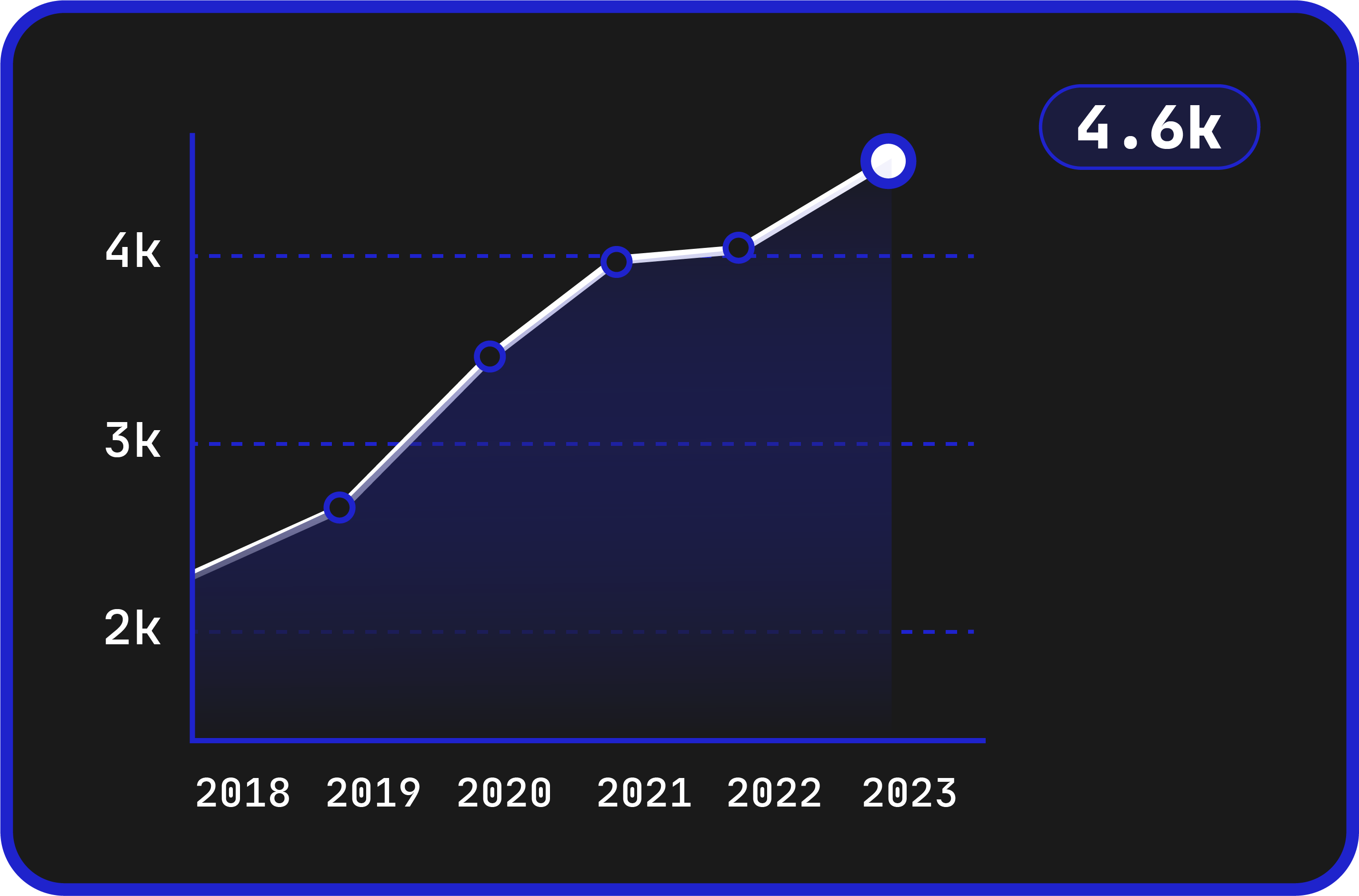
Number of cases from 2018-2023
Source: UsableNet Midyear Report
The product
Lor Tush is an e-commerce business based in Baltimore, MD that sells sustainable bamboo toilet paper, and is focused on making a positive impact both locally and globally.

Accessibility statement (found in footer)
“Lor Tush is committed to making our website's content accessible and user friendly to everyone. If you are having difficulty viewing or navigating the content on this website, or notice any content, feature, or functionality that you believe is not fully accessible to people with disabilities, please email our team at cs@lortush.com with "Disabled Access" in the subject line and provide a description of the specific feature you feel is not fully accessible or a suggestion for improvement.
We take your feedback seriously and will consider it as we evaluate ways to accommodate all of our customers and our overall accessibility policies. Additionally, while we do not control such vendors, we strongly encourage vendors of third-party digital content to provide content that is accessible and user friendly.”
The website [Warning: flashing images]
Immediate observations
The animation was the first thing I noticed when casually visiting the site, and it revealed two Level A failures right away:
2.2.2 Pause, Stop, Hide: every animation on the site starts automatically with no way to pause, stop, or hide it.
2.3.1 Three Flashes: the colorful toilet paper images flash roughly 2.25 times/second. That’s under the 3-flashes/second limit, but combined with all the other simultaneous motion it could still trigger a seizure for an epileptic user.
This much motion can be problematic for users with AD/HD, autism spectrum disorder, dyslexia, epilepsy, anxiety, and migraines.
The proposition
After noticing these problems, I approached the co-founder of Lor Tush and told her that I was IAAP-certified and could properly audit the website for WCAG issues as well as assist in remediation, given my UX design background. They were excited to create a better experience for their users- so we moved forward with an accessibility audit.

Audit scope
WCAG version
2.2
Website scope
Essential web content located at lortush.com that may require access in order to make a purchase.
Additional requirements
The report will include a list of all issues identified by the evaluator, as well as a summary of findings.
Conformance target
AA
Support baseline
MacBook with VoiceOver, Chrome with keyboard navigation and NVDA, axe Devtools, WAVE, Stark.
Web technology
HTML, CSS, WAI-ARIA, JavaScript
Numerical results
Reported on 55 of 55 WCAG 2.2 AA Success Criteria.

10 failed level A success criteria (most critical)
Beyond the motion issues, most Level A non-compliances came down to substandard coding practices. In fairness to the client, the site was built on Shopify with a theme created before Shopify introduced accessibility requirements for new themes.
Semantic HTML, meaningful sequence, and heading hierarchy were entirely ignored, making the site difficult or impossible to navigate for blind users.
No-code platforms must keep baking in accessibility features, but their users also need a basic understanding of accessibility for those features to be effective.
Here are the most critical success criteria failures I came across, and how they might be fixed…
Perceivable WCAG criteria
Essential failures
1.3.1: Info and Relationships
1.3.2: Meaningful Sequence
1.3.1: Info and Relationships
Criterion 1.3.1 requires that structure and relationships conveyed visually can also be programmatically determined, mainly through semantic HTML, ARIA, and proper headings, so screen readers can interpret the page. Here is a visual representation of the headings on the homepage, thanks to axe DevTools:
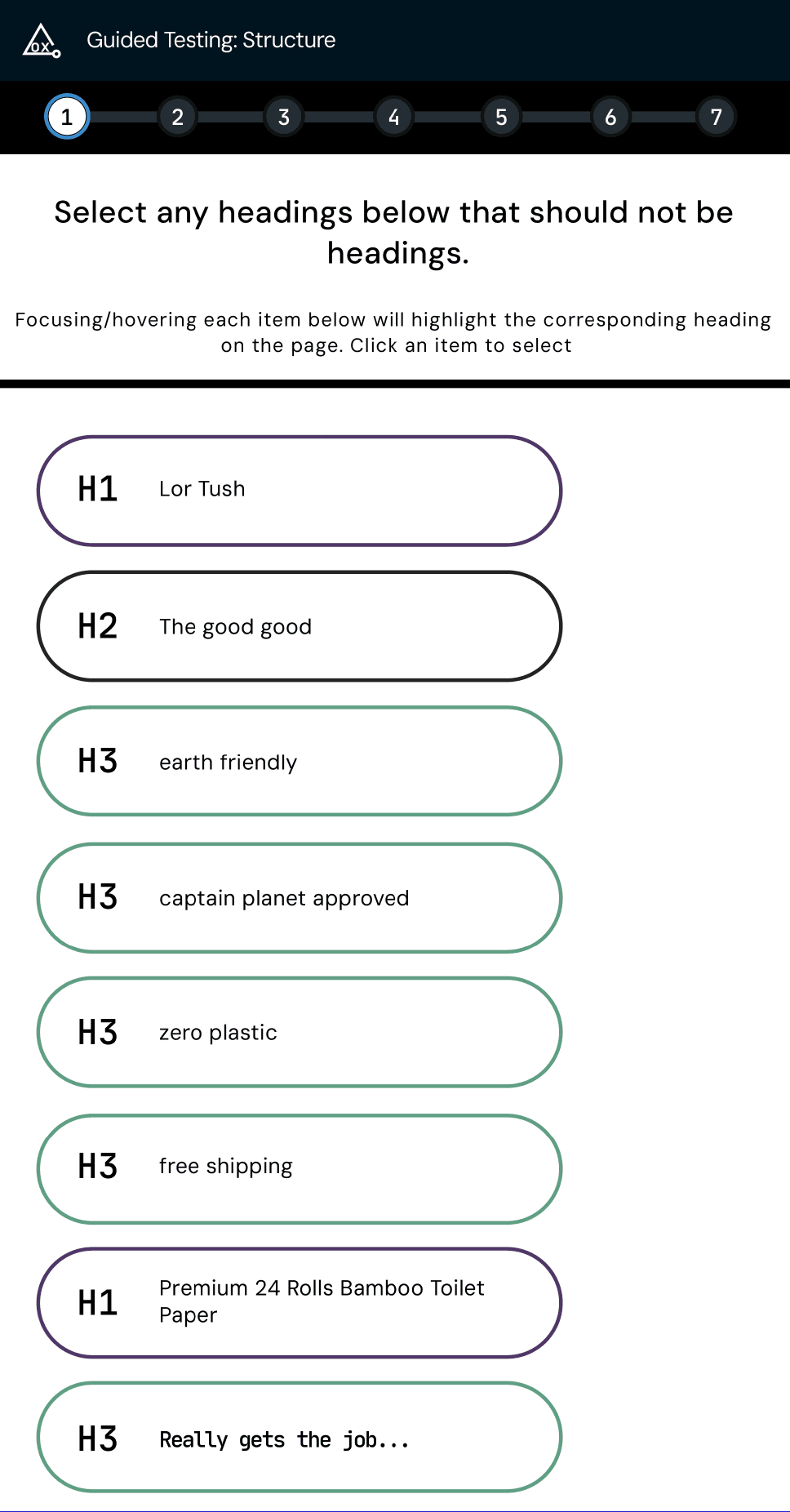
What the heading map reveals:
Headings were used for style rather than structure. There are 17 headings on the home page, many not descriptive, and some shouldn’t be headings at all. Sighted users can follow the layout, but screen reader users are met with a confusing delivery of information.
Outside of headings, semantic HTML is nearly ignored entirely. Elements with inherent meaning like <nav>, <main>, <p>, <button>, and <a> are often replaced by generic <div> and <span> blocks that tell assistive technology nothing about what content is.
Because so little of the markup is semantic, the screen readers I tested with (VoiceOver and NVDA) can’t reliably interpret the page. The newsletter signup form below shows the pattern well — it at least uses a real <button> element, but the rest of the form gives assistive technology almost nothing to work with:
<form>
<h3>Join our newsletter</h3>
<input type="text" placeholder="Email address">
<button type="submit">Subscribe</button>
</form>
Solution
In the markup above, the email field has no label at all — it relies on placeholder text that disappears the moment a user starts typing. Sighted users can infer the field’s purpose, but screen reader users hear only an unnamed text field, and anyone distracted mid-entry loses the only visible clue. The fix is plain HTML: associate a real <label> with the field and use the email input type. I also added autocomplete, which satisfies SC 1.3.5 Identify Input Purpose:
<form>
<h3>Join our newsletter</h3>
<label for="email">Email address</label>
<input type="email" id="email" autocomplete="email">
<button type="submit">Subscribe</button>
</form>
1.3.2: Meaningful Sequence
Like 1.3.1, this criterion is about screen reader interpretation, but it focuses on whether content is read aloud in the same order a sighted user experiences it. I tested with two screen readers. VoiceOver read the page somewhat sensibly (minus the missing product descriptions), but NVDA, a far more popular screen reader, struggled badly. Here’s the transcript of what NVDA reads aloud through roughly half of the Home Page:
lortush.com selected
lor tush® bamboo toilet paper. wipe on playa, wipe on. – Lor Tush
clickable link Skip to content
complementary landmark Free shipping on all orders!
Primary navigation landmark list with 2 items visited link current page Home
link Shop out of list
heading level 1 visited link graphic Lor Tush
link Log in
button Cart (0)
main landmark 586D4D0B 8D6B 4614 8EA3 6E6E8D46C1EE frame clickable
button Copy link
link Watch on www.youtube.com out of frame
wipe on playa, wipe on. wipe on playa, wipe on. wipe on playa, wipe on.
Watch on www.youtube.com link
buy now → link
lortush.com visited link
lortush.com visited link
lortush.com visited link
lortush.com visited link
Premium 24 Rolls Bamboo Toilet Paper link heading level 1
Add to cart → button
clickable Buy now with ShopPay button
Several of these failures are documented under their own criteria elsewhere in this audit. I'm surfacing them here because 1.3.2 is where they compound: individually they're annoyances, together they make the page unnavigable by ear. This confusing string of speech is largely the sum of poor sequencing, missing semantic HTML, and generally poor code. If i were reliant upon a screen reader, I’d likely give up and spend my money elsewhere before getting past the home page. That matters beyond ethics: the U.S. has 3.5 million legally blind adults, and disabled people account for 26% of the adult population.
Solution

Operable WCAG criteria
Essential failures
2.2.2: Pause, Stop, Hide
2.4.7: Focus Visible
2.2.2: Pause, Stop, Hide
Criterion 2.2.2 states that any moving, blinking, or scrolling content that starts automatically, lasts over 5 seconds, and sits alongside other content must be pausable, stoppable, or hideable. The homepage has a video background, scrolling text, and quickly flashing images, none of which the user can control.
Who it affects: users with cognitive and neurological disabilities such as AD/HD, epilepsy, and dyslexia, for whom this much motion adds distraction and cognitive load. In epileptic users it could even cause a seizure.
It hurts everyone: in a Nielsen Norman Group survey, 95% of users felt some websites contain too much animation, and 77% said animation was distracting or made no difference. Accessibility and usability intersect here.
Solution
To fix this WCAG failure one can either change the animations in question to static images, shorten the animations to 5 seconds, or add a means of pausing or hiding the animation to each animated element.
2.4.7: Focus Visible
Criterion 2.4.7 supports users who navigate with a keyboard instead of a mouse: as you tab between interactive elements, the element in focus must be visibly highlighted, like this example from LorTush.com.
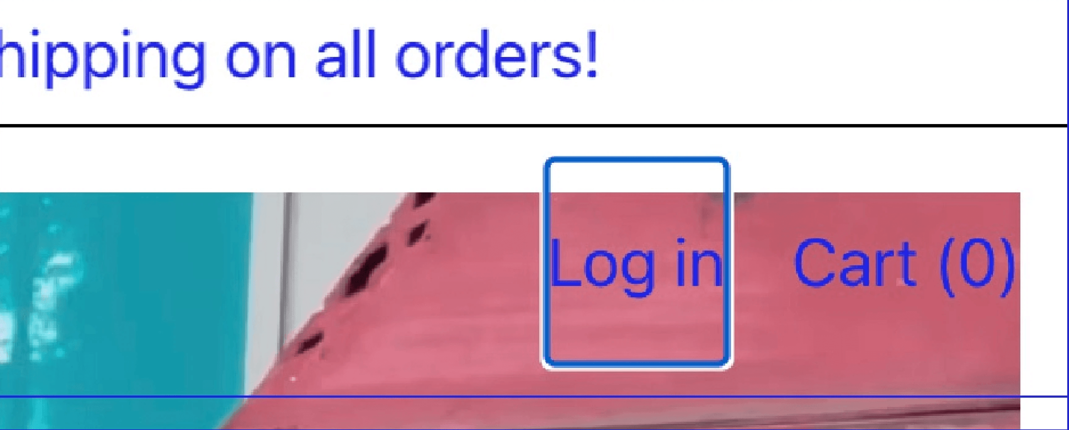
Keyboard navigation is relied on by users with motor disabilities (muscular dystrophy, cerebral palsy, carpal tunnel), people with temporary injuries, and low-vision users who find a keyboard easier than a magnified pointer. The focus indicator worked on most pages, but in a large product section of the homepage (the same section with the non-semantic code) it disappears entirely, only reappearing in the next section.
Solution
The issue was caused by using non-semantic <div> tags for multiple interactive buttons. The solution is replacing them with native <button> elements, which automatically restores standard keyboard focus states and visibility.
Robust WCAG criteria
Essential failures
4.1.2: Name, Role, Value
4.1.2: Name, Role, Value
This Level A criterion requires that every user interface component exposes its name, role, and value to assistive technologies.
Name: Many buttons on the site do not have accessible names so screen reader users aren't aware of their name.
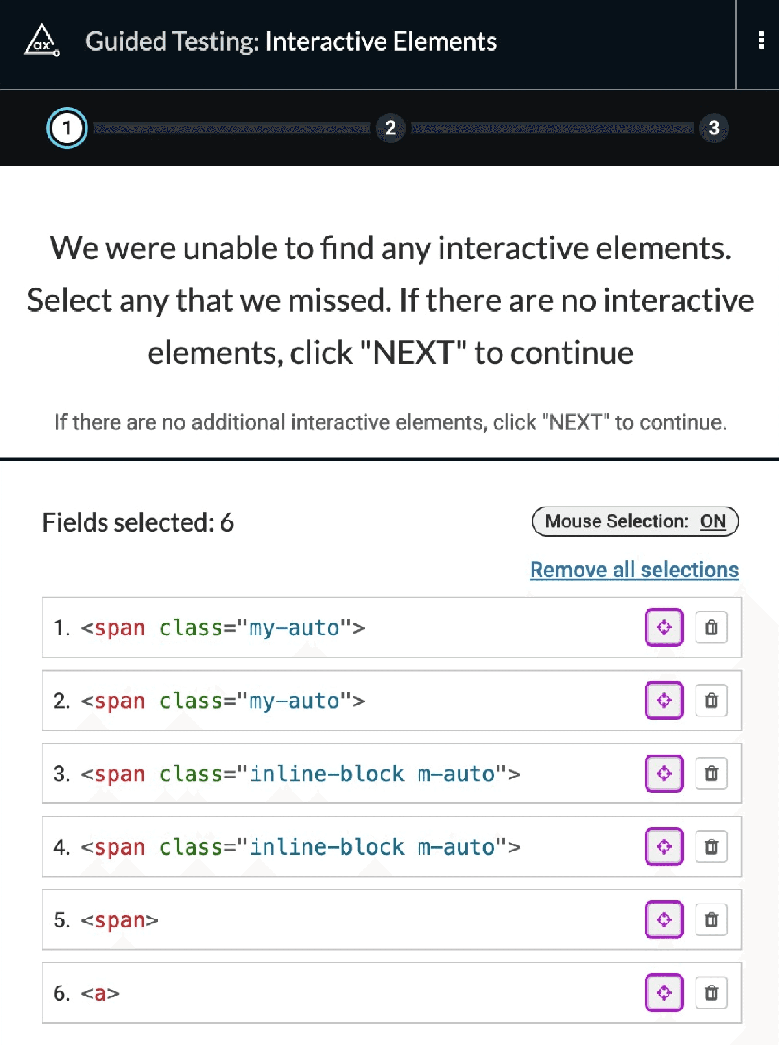
Role: the near-total lack of semantic HTML means assistive technology can’t recognize interactive elements. AXE DevTools detected no interactive elements when scanning the homepage, and this is what the elements looked like in code once I selected them manually…
Solution
First, replace <div> and <span> tags with semantically meaningful elements: <button> for actions (like "Add to Cart") and <a> for navigation links. This menas buttons are't read off as "button", for axample. As a less optimal alternative, ARIA roles can provide semantic information to screen readers. Shopify's drag-and-drop builder likely favored <div> tags and <spans> for styling simplicity, but swapping them for appropriate semantic elements will let assistive technology recognize these interactive elements.
End Result
We completed the audit phase, but did not proceed to remediation. The client understandably underestimated the complexity of digital accessibility, and with this website being one of several ventures, they chose to prioritize elsewhere. To support them, I referred the client to accessible Shopify themes and suggested a few key accessibility practices to focus on going forward.
This experience reinforces a known truth in the accessibility field: it is exponentially more expensive to remediate accessibility problems after the fact than to consider them from the beginning, while designing and building a product.